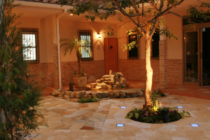
 In high-density developments where every townhouse abuts the next, almost every courtyard is hemmed in by the three high sides of the house and, on the fourth side, by the equally high parapet wall of the neighbouring residence. Because you can’t help but look upwards, awareness of the looming walls becomes acute and the effect can be oppressive.
The way to alleviate this is to create strong focal points at ground and around the mid level of the monolithic parapet wall, so that the eye tends not to stray above a certain point,” wrote prominent Perth garden designer, Janine Mendel, in her new book, Quintessentially Oz — Australian Gardens in the Millennium. The following courtyards — each surrounded by walls more than six metres high — are featured in Janine’s book and illustrate just how successfully these ploys work.
Pip and Phil were considering stringing up shade sails to conceal the fact that their 6m x 4m courtyard basically sat at the bottom of a very deep box, but I pointed out that this would only form a lid, intensifying the feeling of enclosure.
Although they wanted the option of seating up to four people outside, they said the courtyard should be primarily visual — a demand that certainly wasn’t being met by the existing expanse of grey pavers and the starkness of the parapet wall.
I dealt with the latter by designing a lower wall to stand in relief against it. This extra wall rose to just 2.5m, thereby locking the eye to that level.
Having the extra depth of the second wall allowed me to house the workings of the water feature within it. I also incorporated two alcoves to reveal the wall behind. The lines were very simple, but good proportions made the design work well.
I dropped the top of the new wall slightly at one point to contain the reservoir, from which water fell silently down a slender panel of lava-stone tiles. These were chosen specifically for their rippled surface, which gave the horizontality that was needed to counter the vertical accent but without the rigidity straight lines would have produced.
The decking could have emphasised the strict rectangularity of the courtyard if I hadn’t broken up its uniformity. I did this by creating three large decking steppers set into pebbles, and bisected the main deck so each section matched the dimensions of the steppers.
Tall walls create shade for most of the day in winter, so the plants must be appropriate. I used Liriope ‘Evergreen Giant’, which will fill one corner to give a feeling of lushness, three Cycas revoluta (sago palms), Nandina domestica (heavenly bamboo), which is not a true bamboo but has a similar look without the tendency to become too large, and a pot of Lomandra longifolia ‘Tanika’ to complete the foliage selection. A Gingko biloba (maidenhair tree) was planted in the corner where Pip and Phil wanted to put a Buddha statue.
They had particularly desired a pleasant view from their kitchen, which accessed the courtyard. The design gave them the visual interest they needed, together with enough greenery to make the courtyard look fresh and inviting.
In confined courtyards with a limited number of materials, subtle but significant detail can be developed from the smallest sources.
Part of my brief from Pip and Phil was to include good lighting. Uplights in the wall alcoves and decking, and below the water feature and the maidenhair tree, provided illumination that was more than just functional. It accentuated texture, shape and contrast by revealing the depth of the new wall, the glint of the water and the shadows cast by the tree at night, which was especially sculptural without its leaves.
For the spaces outside the decking I chose large-format pebbles because they have a chunkiness about them that adds to the play of light and shadow in the interstices of the floor.
Like Pip and Phil, Krystyna said her courtyard would be mostly for looking at, though she also wanted the choice of occasionally seating two people in a sophisticated and contemporary space.
I decided to create that opportunity without cluttering the courtyard with furniture that might seldom be used and I was determined that, if she did sit outside, her gaze wouldn’t constantly be wandering up to the walls towering around her.
I placed a rectangle of timber decking parallel to the doors of the house that faced the courtyard, and positioned a smaller, square, raised platform overlying that main deck.
The idea was that the smaller platform had the potential for several roles. It could be used to support a sculpture if Krystyna chose to buy one. Alternatively, it would be somewhere for her to sit while enjoying a coffee outside or, with the addition of cushions, it could become a daybed.
Even if it wasn’t used for any of these purposes, the platform was a valuable design element because it created a focal point at another level.
As I didn’t have the depth of an extra wall to house the workings this time, the water feature had to stand proud of the parapet wall. Enclosed in a stainless-steel frame, it had granite cladding to create some texture for the water to stream across.
To balance the water feature, which sat about one-third of the way along the wall, I positioned three lights to the left, staggered evenly down the wall. These were backed by a fibre-cement panel coated with a rust paint, which produced an irregular surface grain that caught the light.
A large, multi-stemmed Dracaena marginata stood between the water feature and the rusty panel as a softer form against their hard geometry. The strong design of this grouping successfully distracted attention from the tall parapet wall above.
Krystyna has a dog, so we decided against using soft mulch, which could be dug and scattered. Instead, white pebbles filled one side of the decking, with just four Lomandra longifolia ‘Tanika’ randomly planted to break up the severity of the pebbles. The other side of the decking held Liriope ‘Evergreen Giant’.
Perpendicular to the water feature, I designed an extension — a dry rill — to run through the decking. But because the wall from which it came wasn’t parallel with the decking, the rill had to enter at an oblique angle, which added to the dynamism of the design.
There was a simple reason for the rill being dry. Krystyna was worried that an open reservoir might pose a danger to her tiny dog. However, I wanted the composition of the dry rill to respond closely to the character of the water feature. Dark-grey pebbles echoed the hue of the granite, and the stainless-steel sides continued horizontally the vertical frame from the wall.