When a Kensington mansion apartment received a modern makeover, it was necessary to retain its heritage features and integrate them with contemporary finishes and furnishings.
Most interior makeovers only need to please the designer and client, and perhaps the local authorities if there are structural changes. But when the project in question is an apartment that was once part of a very large London mansion built c. 1850, it also has to satisfy English Heritage, the organisation charged with promoting and preserving England’s historic places.
This listed three-bedroom residence, set in a prestigious west London garden square location — one of Kensington’s smartest, in fact — retains many of its original features, such as well-proportioned skirtings, deep elaborate cornices and the original mahogany entrance door.
So when Rene Dekker was commissioned to undertake the interior redesign, the challenge was to retain the period character, freshen it with contemporary finishes and “add the magic”, as he puts it. When he came on board, all planning approvals and heritage consents were in place.
Little was changed in the 280sqm layout — which comprises three bedrooms all with ensuites, a reception room, adjoining eat-in kitchen, study, guest cloakroom, lobby and entrance hall — so it’s the finishes and furnishings that ultimately deliver Rene’s magic.
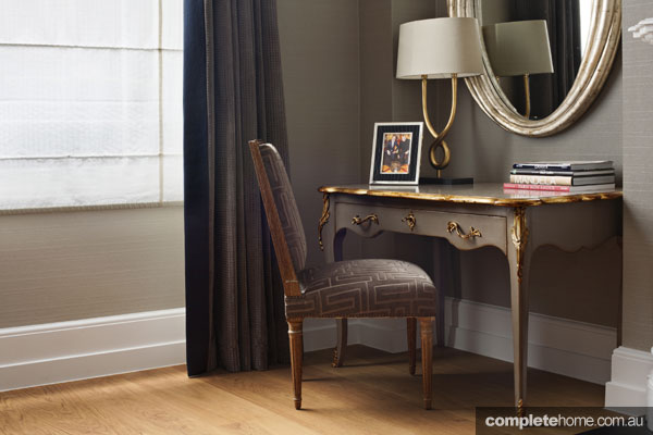
Whether it’s the doors lacquered as smooth as glass, textured polished plaster walls, randomly sized oak-plank flooring or book-matched marble, all the finishes are carefully chosen to convey glamour, comfort and luxury, while still being restrained and subtle. The designer’s description, “understated elegance”, is certainly apt.
Rene’s dedication to seeing his ideas realised is unstinting. Take the finish on the walls of the reception room, for example. With a small piece of water-damaged silk as his inspiration, and working with specialist decorators DKT, he came up with a sumptuous blend of taupe, gold and pearl paint to achieve the aged silk look. “It’s never a problem getting exactly the right finish,” he says, “as long as you work with professional people who understand the value of the finished product.”
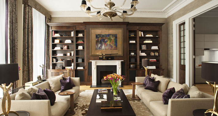
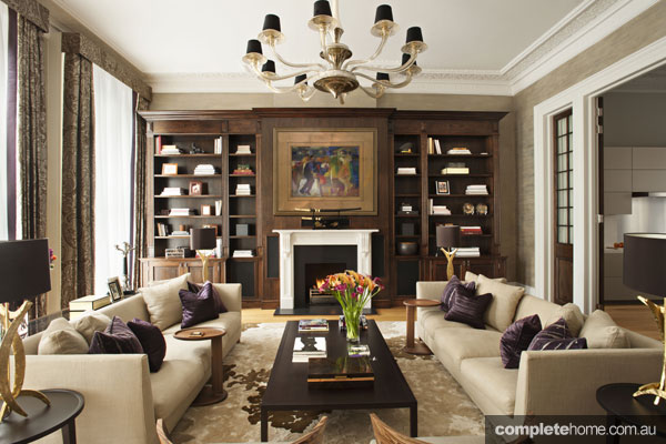
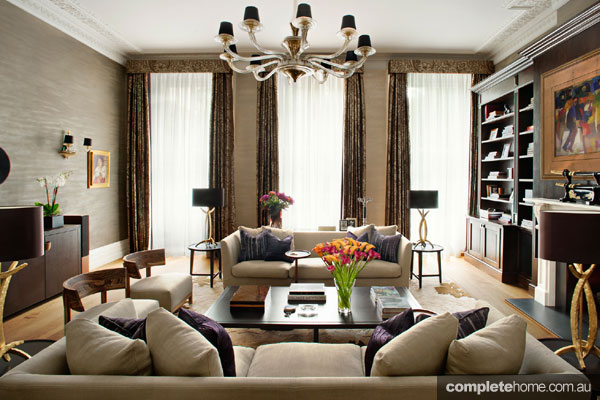
Right from the entrance hall, the ambience is warm and welcoming, even though this area lacks natural light. In the elegant reception room, bespoke modern-style sofas, stylish Zebrano chairs and four identical oval occasional tables, all arranged in perfect symmetry, invite conversation and relaxation. There are quite a few furniture pieces in this room yet there’s still plenty of space to move around the seating area.
The centrepiece of the reception room is a vibrant painting by Iranian-born artist Hessam Abrishami. Vying for attention, too, is an amply proportioned Donghia chandelier and a reclaimed Victorian fireplace surround from Chesney’s. The fireplace is flanked by dark-panelled shelving for displaying the objects and mementos that personalise the room.
As in most homes, the adjoining eat-in kitchen, which can be closed off with full-height oak and glass doors, is the heart of the home with its eight-seater dining setting and very modern appointments.
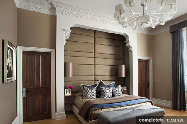
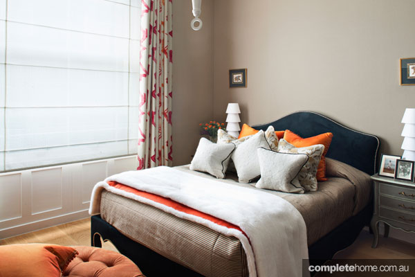
The three bedrooms are a triumph of comfort and style. The symmetry of the master bedroom with its twin walk-in robes and ensuite is structured around an architectural folly that had to be preserved for heritage reasons. The folly frames the bed, which sits against a magnificent padded headboard made up of a series of panels upholstered in nubuck. The colour palette of rich taupes with Midnight Blue accents and crisp white trims is both sophisticated and restful.
As far as children’s bedrooms are concerned, Dekker is something of an expert. His approach is to create a design the children can grow into so that their rooms don’t need a makeover every couple of years. To achieve this, the designer says, “I like children’s rooms to combine the vitality of youth and an element of fun with adult sophistication.”
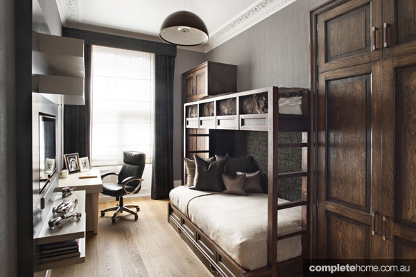
The teenage girl’s room, with its tangerine and off-white colour scheme, is fresh and feminine, as well as youthful yet sophisticated, while the boy’s bedroom in tones of charcoal, smoke and gunmetal is masculine and very functional, furnished with bunk beds and a wall unit designed to house the TV and games console. The larger bottom bunk acts as a sofa when it’s Xbox time.
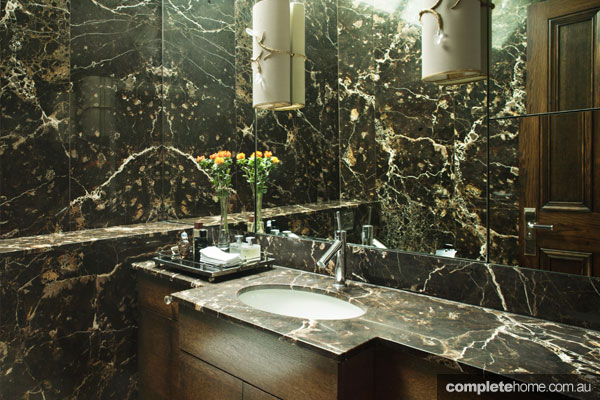
There are always quirks that create design dilemmas in old buildings. In this home, the guest WC had the team scratching their heads. “The original room had uneven walls with nooks and crannies and a full-height window with an angled skylight that looked onto a dark lightwell — no pun intended,” explains Rene. The solution was to hide the window behind the honed Noir St Laurent marble that clads the walls, introduce light through a frosted skylight and completely mirror one elevation, hiding a cleverly designed storage unit and creating the illusion of space.
As a family home, this heritage-listed apartment is not only comfortable, warm and welcoming, but exudes contemporary style and elegance while still remaining faithful to its past glories.
Expert advice:
In a small bathroom, a full mirror wall creates the illusion of space and doubles the visual impact of beautiful materials
Genius trick
To retain the architectural folly in the bedroom for heritage reasons, the padded bedhead was created from a series of individual nubuck-upholstered panels designed to perfectly fit the nook
For more information
renedekker.co.uk
Words Kerry Boyne
Photography James Silverman
Originally from Home Design Magazine Volume 17 Issue 3


