Whether it’s building a new house or updating an existing dwelling, homeowners become immersed in wide-ranging style decisions on everything from furnishing, lighting and art, though to material and colour selection, how to integrate pattern and decoration, or which eco-friendly technology to install. Successfully achieving the home you want also includes thought to landscaping, storage, kitchen and bathroom solutions. Enter the interior design specialist, skilled in honing the decision-making process and creating homes we can to enjoy for years to come.
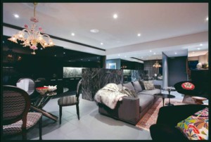
Leading designers and architects track the latest products and materials by devouring design and fashion-forward publications, globetrotting to key design fairs such as Maison & Objet in Paris, a leading object and accessory fair, Salone de Mobile in Milan, the king of design weeks, or scour Art Basel. They consume new directions with passion. But inspiration comes from other places also — a new hotel, a gobsmacking retail outlet, a quirky bespoke hole in the wall, hand-woven rugs in Turkey, or an ecoresort in Byron Bay. Then there’s the influence of individual and unique objects that may be found at Paris Flea markets, LA antique dealers or locally at industrial furniture auctions. We spoke to three designers, who while stylistically are diverse, all agree the key to a great interior is that the end result reflects the personality of its inhabitants and that the environment enhances the quality of their lifestyle. They also agree that key to a good interior is timeless design, quality fixtures and fittings, and ultimately a space the residents will embrace living in for many years to come. Their key tips are simple. Design classics don’t date, quality is a great investment and find a style that reflects who you are and how you want to live. Greg Natale is not shy when it comes to decoration, and sees its return as a reaction to the minimalist interiors of the 1990s. In his work he incorporates a range of styles, including ‘Hollywood Regency’ and ‘Palm Springs Regency’, drawing inspiration from the likes of the late English interior decorator David Hicks, who was famed for his use of bold colour, vibrant pattern and mixing antique and modern furnishings and contemporary art. “A client came with a very clear brief — Hollywood Regency with a 1940s slant. It’s a style popular form the ’40s through to the ’70s that embraces opulence, pattern and decoration over mid-century minimalism. I think it’s so relevant now after ’90s minimalism. It’s now about layering decoration,” Greg explains. The styles are also known as ‘New American Regency’ or ‘New Regency’. The result for this house was a predominantly black/white palette with ebonised timber, Lucite (acrylic) and chrome elements, offset by ornate fittings such as an exquisite Venini Murano glass chandelier above the kitchen island bench — most of these were sourced by Natale on a buying trip in Los Angeles.
“The client, an Australian residing in England, requested wallpapers by the late Australian artist Florence Broadhurst, which were used as shadow patterning on walls in bathrooms and bedrooms. The clear glass cabinets showcase collections of Wedgwood china and Waterford crystal,” Greg continues. “The living area is a relatively small open-plan space, so we let the kitchen island be central, making it a stand-alone piece of furniture. Originally it had a heavy bench that went to the floor, but as this house is quite formal we made the island bench float above the floor. This is also a great way to make an architectural statement,” he continues. The kitchen also has its utility elements partially concealed from the surrounding dining and living areas. The result is a contrast of rich dark colours, dark polished floors with crisp white walls. Merging minimal elements and decoration and oozing 1940s Hollywood glamour in a contemporary way, imported antique pieces were paired with furniture custom made by Mortice & Tennon and inspired by William Haines, an interior designer whose clients included Joan Crawford, Gloria Swanson and Nancy and Ronald Reagan. “Contrast is important,” Greg states. “Don’t be scared of it. You don’t have everything look the same. Balance a curve against a straight line, black against white, a solid block of colour with pattern, contemporary lines against classical”. For Greg it’s about mixing the classical with the modern. Arent&Pyke interiors are imbued with eclectic elements, deftly combining existing objects and finishes with more modernist items, creating a timeless space not reflective of any particular era. “People spend increasingly more time at home, so it’s important their space relates to them. When we’ve completed a project the result, ideally, looks as though the clients have done it themselves. Well, perhaps with a little help, but not to appear ‘designed’. And it should certainly feel like a home,” explains Juliette Arent. “We embrace ideals of longevity over ‘fashionable’ elements that change with the trend of the moment.
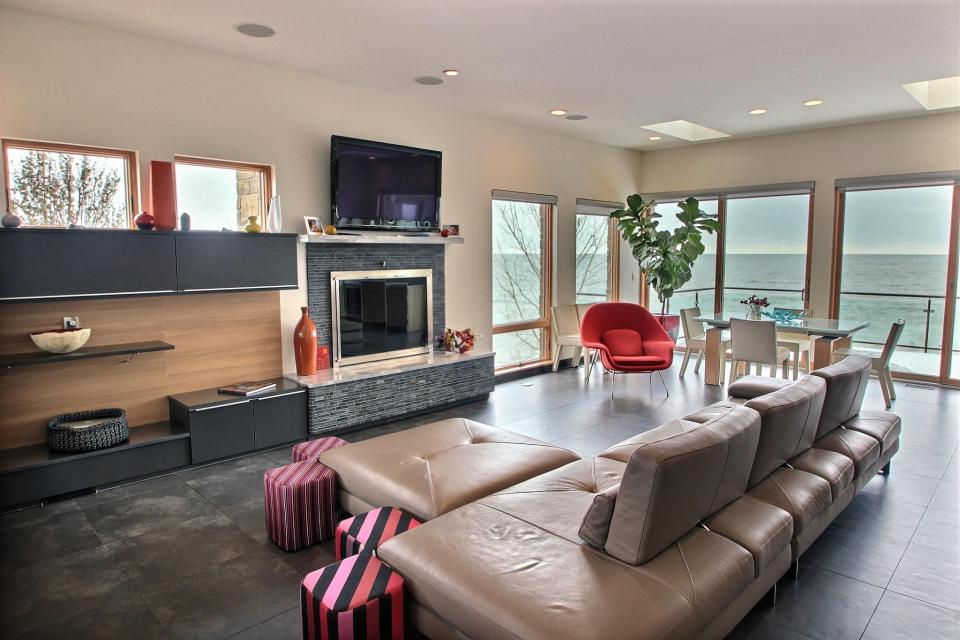
Representing the personal style of our client is paramount.” Like Greg, Arent&Pyke favour a layered approach when creating the interior scheme. “We complete the furniture layout and placement of art at the outset, combining existing pieces and new elements to ensure each space is personalised of each project,” Juliette shares. “Introducing unique or handmade elements give interiors a natural, yet individual feel. It’s important to consider what’s appropriate to the client, as well as the site, in terms of functionality, durability and maintenance.” The result both looks and feels relaxed, oozing the inhabitants’ personalities. Arent&Pyke encourages clients not to be scared of mixing colour and materials to add a tactile dimension. “We look for key elements to anchor a space, such as flooring in living spaces, benchtops in kitchens and feature fabrics for decoration, then build the interior scheme from there,” says Juliette. This was done in a Sydney Art Deco apartment, where they retained the original floorboard patina and painted walls ‘liquid papery white’ to showcase a contemporary art collection. When it comes to lighting Arent&Pyke likes to “keep it simple”. Arent&Pyke see two directions with Sydney living rooms. “For a relaxed ‘beachy’ feeling, we love the Gervasoni Ghost Range from Anibou with white slip-covers,” says Juliette. “For a more tailored and elegant interior we always specify Minotti, the sofas and armchairs from Dedece. They are beautifully upholstered and richly detailed, which sets them apart from other Italian-brand sofas.”
When it comes to children’s rooms, inspiration and stimulation is key. “We love pattern for young children and have used large murals, wall maps or a wallpaper tree — the kids love them. Make storage and joinery age specific,“ suggests Juliette. “Use clothes rails that children can reach and cubby holes for them to put their things away. Use washable fabrics.” “We’re seeing a return to industrial detailing — mixing industrial finishes such as aged brass, which is coming back in a big way, with blackened steel, then combined with a contrasting material such as mesh for example. We’re also seeing influence from the classical modernists such as Le Corbusier being reinterpreted in a contemporary way — such as ecru-coloured linen seat upholstery on sofas with tan leather piping as a detail. It’s not always about a monotone palette; it’s more about mixing up both colour and material,” says Shareen. “We value the integrity of solid timber flooring, and stones such as ‘classic’ or ‘silver’ Travertine for soft tones, and charcoal Basalt or Porphyry, which appear like textured volcanic stone. These floors are teamed with polished plaster or solid masonry walls. Windows can be either steel frame or frameless, depending on the project, furnished with motorised venetian blinds — either painted timber or black aluminium.
Exposed beams, if existing, retain original elements.” Consulting colour and product directions to big brands such as Sheridan, Shareen explains future directions in paint colour and combinations. “We are seeing unexpected colours used together — for example, burnt colours such as burnt russet with minty colours such as pistachio green, and the palette anchored with black and white to tone it down,” she says. “Neutral tones are used more frequently in our work, they are more classic. By using a design professional you can get the correct combinations or even the right shade. Getting the correct white is not as easy as one may expect. It’s all in the balance, as colours are very tone sensitive. We prefer to see colour in furniture or accessories rather than adding to walls. Consider a splash of colour with a door or on an awning as an accessory. Use it as a detail such as piping on upholstery. It also makes changing your accessory colour easier if you want to change your look.” Shareen sums up: “We favour materials and finishes to be as natural and lasting as possible, and use furnishings, fittings and lighting that reflect quality contemporary design — both new-release and 20thcentury classic designs. It’s more about ‘subtle elegance and style’ with our client base. Understated luxury is important.”


