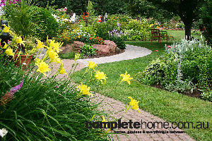
To begin putting together a colour palette for your courtyard, have a closer look at the colours you can’t or don’t want to change, such as your house bricks, pre-coloured render or stained timber. Although many houses are a relatively neutral colour, there’ll usually be an undertone that you need to recognise, as this can become a lot more obvious with other colours alongside.
Dark brown bricks may have purple notes, beige and cream neutrals also show yellow, green or pink, while greys have undertones of blue, green or purple. Those secondary colour elements may not be obvious until you start working other colours in around them. Suddenly, what you thought was an easy neutral starts to look decidedly different.
Most people prefer the look of the warmer version of a colour when it’s seen in isolation, such as a neutral with pink rather than green undertones. Unfortunately, as many homeowners find, pinkish beige looks more pink than beige when it’s on a wall surrounded by yellow-orange tones, such as lacquered timber or terracotta pots.
Once you’ve established what your base house colours are, you can begin to choose others to work with them. Apart from where they sit on the warm or cool part of the colour wheel, most house colours are slightly “muddy”. They’re not clear, highly saturated colours, but dirtier versions. This means the colours that work best with them will have a similar saturation, such as burnt rather than vivid orange, denim blue instead of sapphire.
The outdoor spaces we like the best have a balance of warm and cool colours. Too many cold colours feels spacious but uninviting, while all warm colours seems too busy and oppressive. When you’re including plants in those pictures, you already have lots of cool greens, so you’ll need to add some warmth. That’s why natural materials such as cane, sandstone and timber work so well in a garden, as they look and feel warm among the greens. Balance also needs to be applied to the amount of light versus dark. Although you might worry about making an area feel dark and closed in, don’t choose wishy-washy tones. Colours lose their intensity in bright sunshine, so always go several shades darker than your first instinct.
When you’re choosing courtyard flooring, such as pavers or decking, neutrals are safe but you’ll need to decide whether a warm or cool neutral will work best. If you’re not sure about a colour’s undertones, have some plain pieces of white paper as well as pale pink, green and buff yellow with you for comparison.
Remember that sunlight bleaches out apparent colour and distance overcomes detail, so the light-coloured paver with a pretty speckle that looks great underneath your feet will become stark and white in distant sunshine. Any contrasting banding or patterning will also make a new colour context for your neutral. Outdoor lights can also make colours look very different, depending on their colour temperature.
Wall colours pull a space together, providing a unified backdrop. In a courtyard, your walls might be the house walls plus a timber or metal fence. Those can be hard to unify, but you can attach paintable waterproof board to vertical surfaces or use cladding. The most appealing balance is a greater area of cool colours compared to warm tones.
By now your courtyard colour palette probably has some background neutrals and one or two stronger colours. Although you still need some accent contrasts, be restrained as fewer colours will always look better and more deliberately co-ordinated. Rather than introduce too many different colours, use tone-on-tone of the same colour, from washed-out through to deeper and more intense shades.
Fabrics are a great way to experiment and really pep it up on cushions, throws, wall hangings and tablecloths. Keep colours under control by using a variety of different patterns in the same colour range, mixing and matching spots, stripes, plaids and florals.


