Lucy Sutherland and Kim Chadwick of Colourways give us a sneak peek at 2012’s top design trends.
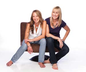
While some people will tell you it’s impossible to predict the trends set to shape the design industry at the beginning of each year, Lucy Sutherland and Kim Chadwick would beg to differ. Lucy and Kim head up Colourways, an initiative established in 1992 by the Design Institute of Australia to accurately forecast colours, materials, finishes and trends. Jointly, they bring over 30 years experience in colour forecasting, marketing and product development to the Colourways program.
Forecasts are developed during annual workshops held throughout Australia and New Zealand. Bringing together like-minded designers, architects, retailers, manufacturers and other industry professionals, the workshops help to identify design influences and provide greater understanding of what is driving current trends. Comprehensive forecast kits, containing real samples, are produced based on the trends that emerge during these workshops.
Usually these kits are only made available to workshop attendees, Colourways members and other interested parties for over $300, but Lucy and Kim have been kind enough to give us a heads up on three of the trends most likely to make an impact this year. They have labelled them Gilt Trip, Authentic Imitation and Saturation Coverage.
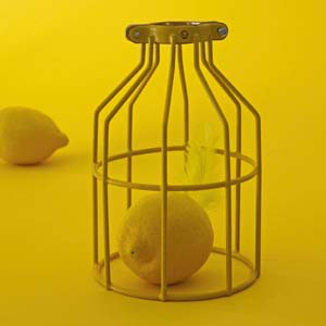
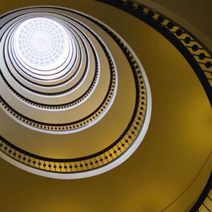
Gilt Trip:
Colours – gold, lemon and mustard.
Finishes – cellular patterned ceramics, vintage poplin, layered golds and honeycomb.
Combining rich shades of gold and lemon, Gilt Trip has an energetic, luscious feel to it. “I love Gilt Trip and am planning on introducing some of those colours into my home,” says Lucy. “When we are putting together these trends, we always have our favourites.”
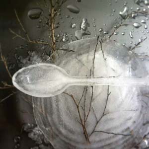
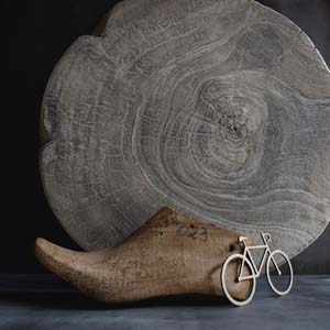
Authentic Imitation:
Colours – greige, silver, white and walnut.
Finishes – unfinished, raw, exposed, linen, concrete and shale.
Authentic Imitation puts an unusual spin on tones and textures. “As technology develops, we are gaining the ability to mimic nature very closely with unexpected products,” says Lucy. “Timber-look finishes are now being reproduced in laminate, vinyl and wallpaper; concrete is being reproduced as paint, wall coverings, ceramics and tiles.”
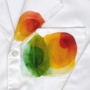
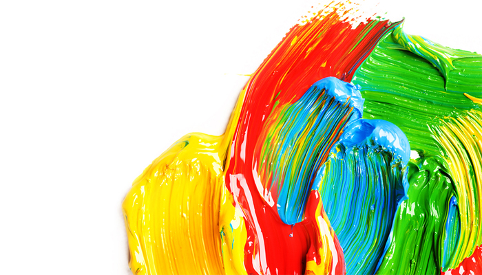
Saturation Coverage:
Colours – orange, vibrant green, yellow, raspberry, bright pink, lime and lavender.
Finishes – random weaves, harlequin stripes, over-the-top, crazy and experimental.
Saturation Coverage bursts with life. The colours are full and used recklessly to add extra impact. “I think that saturation coverage is a response to so much grey over the past few years,” says Lucy. “We want to have fun with colour and be more free-spirited in how we use it. These bold, clear and fun colours are a refreshing change to neutrals.”
Click here to find out more about Colourways or order a Forecast Findings Kit.