
Using colour to define and decorate your outdoor room is easy with the right paint
Colour is a key part of defining and decorating your outdoor room. One of the easiest ways to do that is to use paint — on walls, floors and accent details to draw the room together and integrate it with the rest of your home.
Painted walls are an expected part of internal decorating, but it’s often overlooked in the outdoor room. But just like inside, you can use colours and textures to change the apparent proportions of a space. Paint can bring in any colour of the rainbow, as well as a range of textured and faux surface effects, such as marbling, raking, scratching, mottling and streaking.
Before you rush out and buy some paint, you need to stop and stand back — right back at your far boundary — to have a look at how an outside wall colour might affect an overall view of the house. Although it might work well in the outdoor room itself, that patch of colour might stand out strangely from a distance in an otherwise co-ordinated or neutral palette. If you have unpainted brick walls that you don’t want to damage, you could fix some blue-board panels to the wall and paint them instead.
To change the apparent proportions of a room, you can bring a wall forward by using intense, lighter and warmer colours, higher gloss levels and strongly textured or patterned surfaces. Use this on a far wall to shorten a long, narrow space. Conversely, flat or matt paints, smooth surfaces and darker but less saturated colours recede, so you can use them to push back a long side wall.
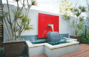
Wall colour can really sizzle and as it’s relatively easy to change, why not use it to make a dramatic and bold statement? The stronger light outdoors makes it a good place to experiment with vibrant orange, spicy red and even lipstick pink.
If you need a unified backdrop for a focal point sculpture or specimen plant, especially when there are criss-crossing service drains and pipes, cracked render or outdoor cupboards spoiling the wall, you can use a dark, matt paint to cover uneven surfaces. Thick texture coatings can be built up to span even substantial cracks. The coatings can be smooth or seeded with sand or coarser aggregates, or scratched, raked, bagged or trowelled for a very rough, textured surface. For really bad cracking there are elastomeric paints and coatings with superior elongation characteristics that form a highly flexible skin.
Colour appearance can vary considerably, depending on the aspect of the wall, how textured the surface is, the reflectivity of the paint, and the outside lighting you use. Before you choose, look at a paint swatch in a variety of different conditions — sunlight, shadows and night lighting to see how it changes. A swatch will often appear darker than the finished wall. Paler colours can reflect stronger colours nearby, making off-whites look orangey or pinkish.
Painted walls can be a good way of balancing warm and cool colours in a room. As we tend to invest in neutral tones in expensive items such as furniture and fittings and use green foliage plants, outdoor rooms can end up dominated by cool colours, which can feel unpleasant to be in. Use a warm-toned palette on walls to make the space feel more comfortable and welcoming, and echo those colours in less expensive cushions, throws, decoration and colourful foliage plants.
If you don’t like the slightly plastic-skinned look of a paint, investigate the range of limewashes available. Limewash paints have a much softer velvety or distressed look, depending on the application technique you use. Murobond, Bauwerk, Porters and FX limewash can be overlayed in several colours for subtle variations. Limewash develops a patina of mottling and streaking over time when used on absorbent masonry such as render, stucco, block and unglazed brick. Bauwerk Marmorino gives a more lustrous polished marble or polished concrete look, and FX paints have a stonework and travertine finishes.
Cement paints (Murobond, Porter’s Boncote) come in a powder form and are mixed up with water. They bond into masonry surfaces and allow walls to breathe. They’re useful for covering up the shadow lines of blockwork. The ultra-matt surface fades a little with time, developing an appealing patina. They can be used on surfaces that get hot, such as chimneys and outdoor pizza ovens. Mineral paints containing silicates also bond to masonry surfaces and last for decades, never peeling or cracking.
Fashion colours for outdoor decorating this season include a wide range of metallics in copper, gold and nickel, as well as oxidising finishes to create faux rust and verdigris looks. Shimmery, opalescent surfaces are also popular, such as Porter’s Industrial Lustre. Aqua and cool blues are restful reflections of a holiday mood, while spicy red, orange and rich pink remind us of exotic hideaways. Big news are the new eco-chic colours of browns and greens with distinct citrus undertones combined with walnut and teak, and also the techno colours of charcoal, steel and cold white.
Once you’ve painted your outdoor walls, a small amount of maintenance will keep them looking fresh. Although strong primary colours can fade a little in sunlight, it’s actually dirt on the paint that does the most damage, penetrating the surface and causing it to break down. Some paints have a “dirt-shedding” technology, but just washing down walls with a mild detergent a couple of times a year will really prolong your paintwork.
COLOUR TIPS
Paint can be used to change the apparent proportions of an outdoor room. To bring a wall forward, use intense, lighter and warmer colours; higher gloss levels; strongly textured or patterned surfaces. Used on a far wall, this will shorten a long, narrow space. To push back a long side wall, use flat or matt paints, smooth surfaces and darker but less saturated colours.