This innovative compact design proves that a small space should never be underestimated

We all want to maximise the space we have but the big question is, how do we do it? How can we make a small area appear bigger? Can we enhance natural light with minimal windows? Can it still be a comfortable home for a young, growing family?
These were the challenges Rod and Simone Barr, of Daarc Architecture & Interiors, faced when they renovated their own family home. Being both the clients and the architects, Rod and Simone were able to push the boundaries of design, ignore trends and focus on creating a space that showcases solutions for compact living and, more importantly, represents who they are.
“Adopting the attitude that bigger is not necessarily better, we were keen to explore the possibilities of overcoming some of the typical limitations of family life in high-density residential living,” says Simone.
A combination of reflective surfaces and mixed finishes has turned their 130m² residence into a modern home that feels spacious. Simone describes the original ‘90s-style apartment as having “lots of small, cramped spaces, a lack of cross ventilation and extensive use of mint-green laminate and beige/cream finishes”.
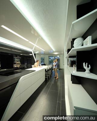
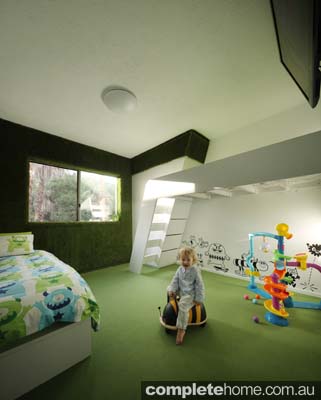
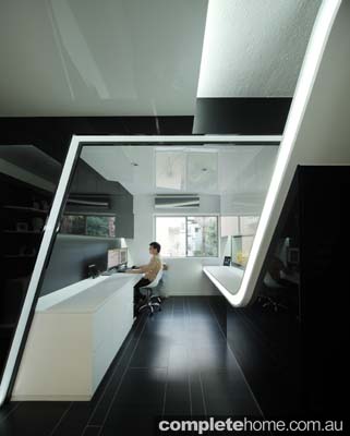
The couple converted the three bedrooms to two plus a home office, a move that instantly opened up the apartment. This reconfiguration has also maximised ventilation and made good use of the few existing windows, enhancing natural light and allowing the outside world to be enjoyed from almost every angle.
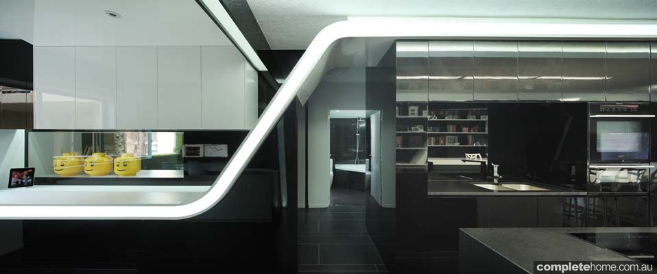
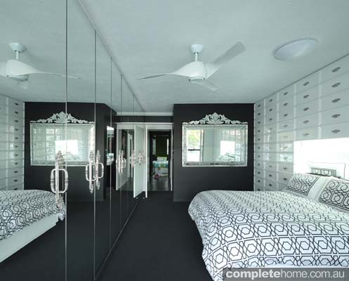
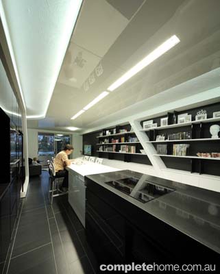
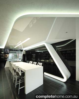
Rod and Simone chose a dramatic aesthetic for the interior, including a monochrome palette and sharp lines. Reflective surfaces are another key element, with each glossy facade mirroring light and scenery, a play that creates an illusion of vastness and amplifies natural light in the apartment.
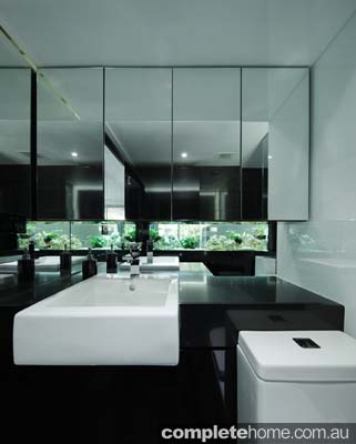
“Reflection was the primary method used to make the space look bigger,” Simone says. “We’ve used it to make the best use of natural light and capture the external views from selected locations, whether from the ‘ghost’ reflections on the walls, the ceiling bulkhead or the kitchen joinery … even the fish tank that divides the kids’ rooms and the bathroom allow for natural light to pass into the bathroom, creating a positive energy in what is a very non-conformist but relaxing bathroom.”
Putting sharp aesthetics and quirky character aside, the couple also wanted to ensure the apartment would be comfortable to live in. But how do you make an almost all-black interior comfortable? While the new floorplan made the most of what the original building had to offer, the existing light fittings were replaced with LEDs and a “less is more” approach to furnishings has kept the space clutter-free. Wherever possible, they’ve used finishes and materials free of volatile organic compounds (VOCs).
“Blue-light LEDs have been used to mimic — as close as possible — daylight conditions,” says Simone. “Low-VOC MDF (medium density fibreboard) was used for the joinery, as well as low-VOC paint finishes and carpet tiles. These achieve the Ecospecifier Green Tag, a green-rating-level ‘A’ certification. LED lighting has also reduced the energy bill by approximately 50 per cent.”
Bigger is not necessarily better. Not only does this compact design demonstrate you can make a huge impression with a small space, it proves you can maximise your interior without the use of light and bright colours.
“Adopting the attitude that bigger is not necessarily better, we were keen to explore the possibilities of overcoming some of the typical limitations of family life in high-density residential living,” says Simone.
WORDS / Karsha Green PHOTOGRAPHY / Scott Burrows
From Grand Designs Australia magazine Vol. 2 No. 4