We investigate how to choose a colour palette that increases your home’s aesthetic appeal, while also adding to its ambience
There’s so much more to colour than just aesthetic appeal. Aesthetics are important, but it’s also imperative to consider how the colour palette you choose for your kitchen or bathroom could affect your mood, your mental and physical state, the success of your chosen design style, and the overall ambience of your space.
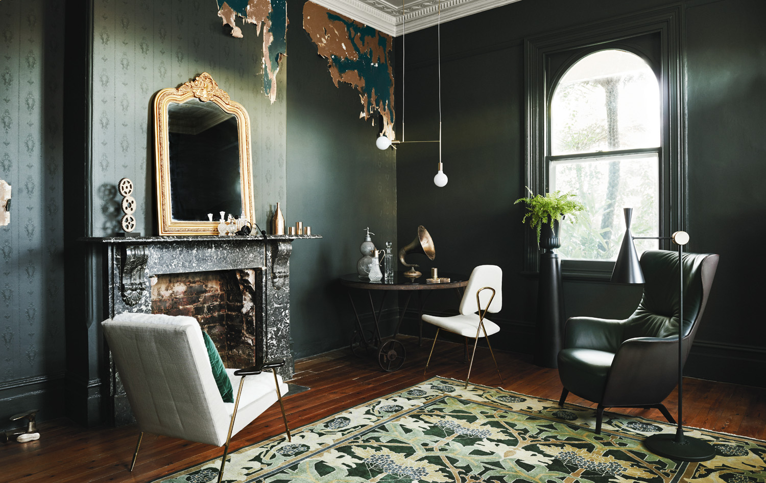
 Image: Bree Leech & Heather Nette King for Dulux Colour Trends 2016 – Retro Remix palette. Photographer: Lisa Cohen
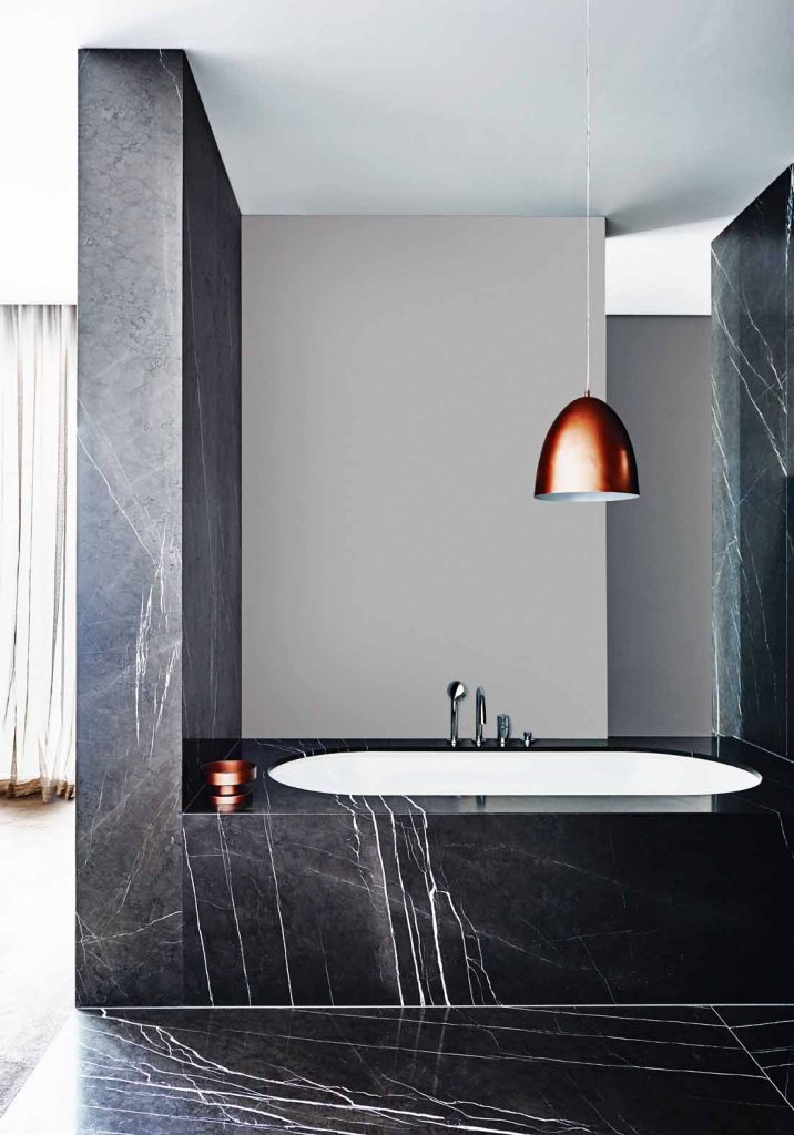
Colour psychology and your space
The concept of a colour affecting one’s mood to the extent that it’s capable of changing behaviour might seem a little strange, but it is a common occurrence. Research has shown that warm colours can create an environment of stimulation, and can also increase one’s appetite, so warm colours and tones are ideal to add to your kitchen’s colour palette. Cool tones, on the other hand, create a more peaceful, calming environment, and are therefore more appropriate for spaces in which one would unwind, such as the bathroom. If you’re the kind of person who finds cooking stressful, we would recommend a cool colour palette for your kitchen space too.
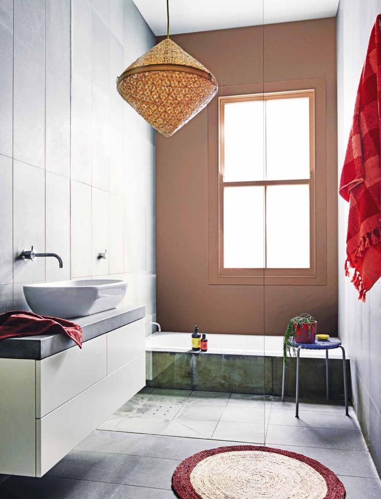
 Image: Julie Green for Dulux. Photographer: Amelia Stanwix
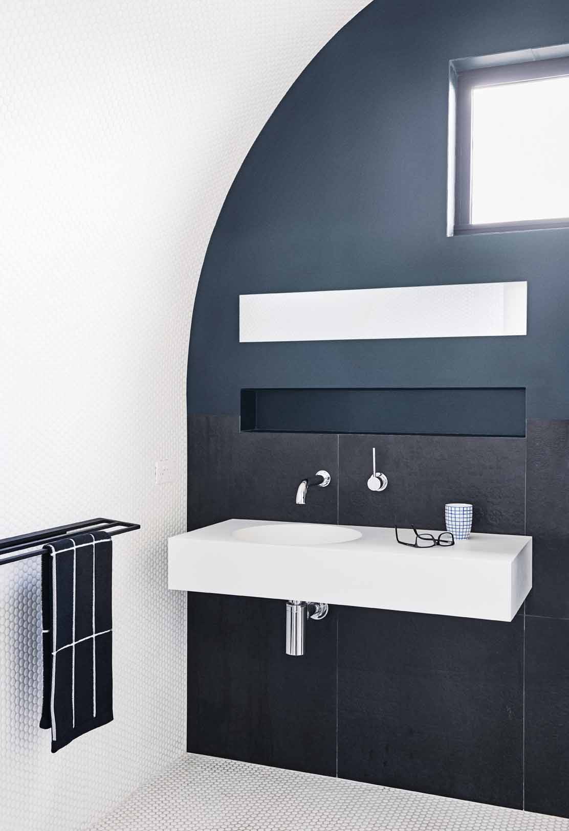
In the mood for colour
Neutral palettes are always a safe option for both traditional and contemporary homes. They are timeless and practical, and lighter shades are generally successful at creating the illusion of spaciousness, while darker greys and blacks are ideal for creating depth. It’s always safest to paint your ceiling in the lightest colour possible, ideally white, as ceilings which are lighter in colour than the adjoining walls create the illusion of a high ceiling, and vice versa. While neutral palettes work well with most design styles, they could become a little dull without a pop of colour. Each possible colour combination will have its own set of pros and cons, so think carefully about the purpose of your space and how the colour you choose might affect the way the space is used. Keep in mind that textiles and materials come in a more limited range than paint. Paint is also more inexpensive and far more effective for the purpose of transforming the feel of a room, so can be experimented with over the years if you feel your initial choice isn’t quite right for your home. A few of our favourite colours for kitchens and bathrooms:
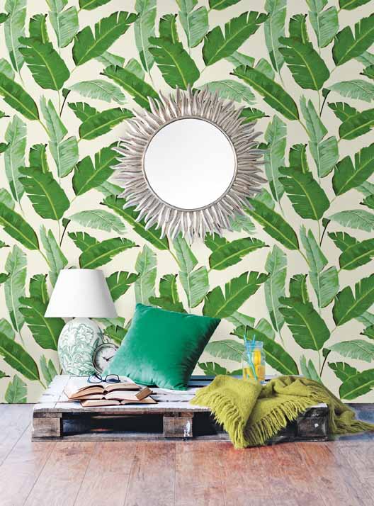
Green: Green is thought to be among the most restful colours for the eye, as it creates less of a strain on your eye muscles than most colours. Green has a calming effect, relieves stress and encourages relaxation.
Red: Known to raise energy levels, red is also associated with an increased appetite — which is why the colour is so commonly used in restaurants and cafes. It’s without a doubt one of the most intense colours in the spectrum, so it’s no surprise it can raise your adrenaline levels, blood pressure and heart rate.
Blue: If a calm, relaxed environment is what you’re after, blue is the ideal colour for your kitchen or bathroom. It is thought to bring down your blood pressure and heart rate, and has the ability to add a touch of serenity to any space. Ensure blues are balance with warm hues to create a space that’s cosy as well as relaxing. It’s also thought to decrease appetites, so it would make a great addition to the kitchens of those who count their calories.


Yellow: Associated with sunshine and happiness, yellow does have an unapologetic ability to add cheeriness to any space. It is welcoming, energising, uplifting, and is believed to have purifying qualities. It does, however, have some negative connotations. Studies have shown that babies cry more in bright-yellow rooms and yellow can have a negative effect on tempers, so be wary of overusing this colour.
Orange: Warm and exciting, orange is an incredibly energetic colour and is capable of evoking enthusiasm. Its bright nature can assist with increasing the cheeriness of your space.
Purple: a mixture of red and blue, purple provides the perfect balance of stimulation and relaxation, which is believed to create and ideal breeding ground for creativity. Purple is also capable of adding a regal touch when used well, due to its association with royalty.
Fashionable shades
Followers of the fashion world might notice that colours permeating the runways each season tend to be on trend for interiors as well. Both manufacturers and consumers are influenced by what is deemed popular and fashionable, and it’s only natural for trends from two industries as similar as fashion and interior design to be complementary.
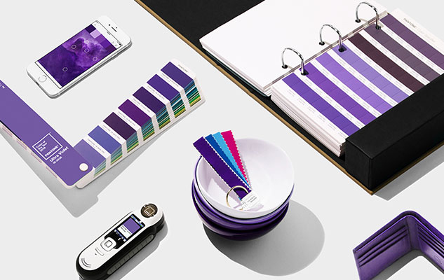
Shades of green were prominent in 2017, both on the runway and in interior style forecasts, largely due to Greenery being announced as Pantone’s Colour of the Year for 2017. For more than 50 years, Pantone has been the authority on colour; its colour choices are often symbolic of what is taking place in the world at the time, heavily influencing colour palette in design, on the runway and in interiors. We have no doubt Ultraviolet will make it’s way into interiors in 2018!
Lifestyle choices
Trends aside, it’s important to choose colours which suit your lifestyle and add to your home’s design style. Think carefully about the reason you chose the design style in question: does it embody a lifestyle you admire or aspire to follow? How does colour impact effectiveness of these design styles and the ambience they exude? Are there colours that will detract from your design style’s character?
These questions must be asked and answered in order to attain an interior look you love. Keep reading to get a feel of the colour palettes which work well with some of today’s most popular design styles.

The right palette
The colour palette you choose does not need to be restricted for use on just your walls, floors and fixtures. Colour can also be infused into your space via furniture, appliances and accessories in order to achieve the right palette and the exact ambience you desire.