
Happy hues or deep blues, pick up a paintbrush to unlock your space’s potential
Ten million. That’s the number of colours the human eye can see. It can be hard enough deciding on what to eat from a menu, let alone choosing a new colour for your home. If you’ve ever faced the colour-swatch panic, you’re not alone. Our advice? Think about which room the colour is for, the ambience you want to create and the existing decor or furniture. Also, consider the effect on your health.
Wellness and colour have been linked for millennia, which is why it’s important to choose a palette for your home that you love and is right for you. Similar to mess in the house, too much colour can clutter a space and your mind. Be thoughtful with your colour choices to enjoy a peaceful home.
Thankfully, a new coat of paint is relatively easy to switch up and can leave your space feeling fresh. With the latest design trends taking the world by storm, we’ve scouted out the hottest colour trends so you can refresh your space with a style that will last. From the Japanese concept of wabi-sabi, which thrives on simplicity and imperfection, to moody and mysterious purples, explore the possibilities with these palettes.

Light blue is soft and welcoming in this entrance. Dulux Colour Awards 2019 — Residential Interior. Cydelia House by fjmt. Photography by Nicole England.
THE COLOUR OF WELLNESS
Can you imagine not seeing in colour? While traffic lights or double-khaki outfits might be an issue, another is the physical, mental and emotional effects of not seeing certain hues.
Our bodies are programmed to respond to colour — to feel hungry when we see those golden arches, feel at peace when staring out at the ocean, or experience melancholy under grey skies. In a world full of colour, our homes are where we can decide what to see. “People are definitely choosing colours based on how they make them feel and this can be different depending on the individual,” says Wendy Rennie, colour and concept manager at Haymes.
Our homes are our sanctuary, the place we eat, rest and simply be. Depending on the purpose of the space, you can create a playful living room or a soothing bathroom with colour, all to suit your individual style.

Warm orange tones make this bathroom feel like a luxurious spa. Dulux Colour Awards 2019 — Residential Interior. Yarra Valley House by Chelsea Hing. Photography by Sean Fennessy.
So, which colour works best for each space? “I’ve seen darker, richer colours being used in bedrooms, such as navy, grey and dark greens to create a calming and relaxing vibe conducive to rest and sleep,” Wendy tells us. “In addition, I’ve noticed that colours found in nature, such as lush greens, soft blues, organic neutrals and flesh-toned pinks, are used to create restful, balanced energy.”
And the statistics don’t lie. A crowd favourite worldwide, blue is considered a soothing and peaceful colour for interiors. Often used in bathrooms or bedrooms, a light blue will complement warm hues in furniture. Natural greens have a similar calming effect and can symbolise life and sustainability. Sunset hues such as blush or orange are perceived as warm and friendly. Yellow is considered joyful because who doesn’t love a bit of sunshine? Purple is tied to mystery, royalty and a splash of creativity. And like the flag of a matador, red is an energetic and passionate colour.
Remember, everything in moderation — including colour. Too much red can make a space feel stressful or full. On the opposite side, an ocean of blue in a room can seem almost glacial. Don’t be afraid to be bold with colour, but keep other elements like the furniture simple so as not to overcrowd a room. Our pro tip: paint a section of your desired colour on the wall and live with it for a few days. Check it out at different times of day, and if you still love it by the end, you might have a winner.
WHAT’S HOT
Some old, some new, but all trending on the Australian design market.
Oh man, cyan!

Blue has never looked so good. At least that’s what it seems like on the design market. Cyan is comprised of soft blue with a playful undertone that can be dressed up — or down. Whether the walls of a subdued living room or part of an ecstatic mix of cool tones in a hallway, cyan is a colour for the adventurous. Look familiar? Cyan is also a colour associated with the clear blue waters of a tropical island; it’s no surprise designers are bringing a bit of paradise home.
Dulux Colour Awards 2019 — Residential Interior. Ivanhoe Residence by Flack Studio. Photography by Sharyn Cairns and Caitlin Mills.
Earthy tones

This year brings about a rise in homes with a closer connection to nature. A colour scheme of greens, browns and yellows evokes a raw and organic aesthetic that mimics the outside world within the home. A restful and refined aesthetic, an earthy palette works well with sustainably sourced wooden furniture and soft woollen throws. Whether you’re after a bit of industrial edge or a minimalist’s delight, go back to your roots with earthy tones.
Taubmans Endure Interior wall paint in Pleasant Hill
Wabi-sabi

A trend that has grown in popularity, wabi-sabi is a Japanese design concept that explores the link between interiors and wellness. Wabi-sabi explores deeper connections to a space’s surroundings through the idea of the perfect imperfection. A philoso phy that embraces the impermanence and flaws of life, and correspondingly aesthetics, reduces the pressure of perfection in the home. There are often simple and natural elements of a wabi-sabi space, with a muted colour palette. Soft tones and mellow combinations are characteristic of a wabi-sabi space, ideal for a bedroom or living room.
Free Flow by Haymes — The Colour Forecast, Vol 12.
Moody magic
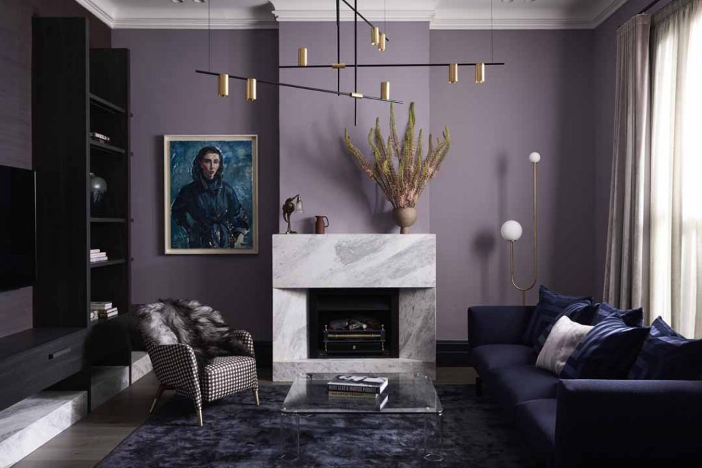
Midnight blues, rich purples and velvet are still thriving in Australian homes. A striking colour scheme perfect for a masculine bathroom or luxurious living room — there’s something very alluring about this dark palette. Complement this colour scheme with gleaming golds or chrome for a look that’ll catapult your space into the extraordinary. From dark kitchens to bold living rooms, this palette works best with plenty of light and a dash of white.
Dulux Colour Awards 2019 — Residential Interior. Blue Moon by Bayley Ward. Photography by Eve Wilson.
Classic white
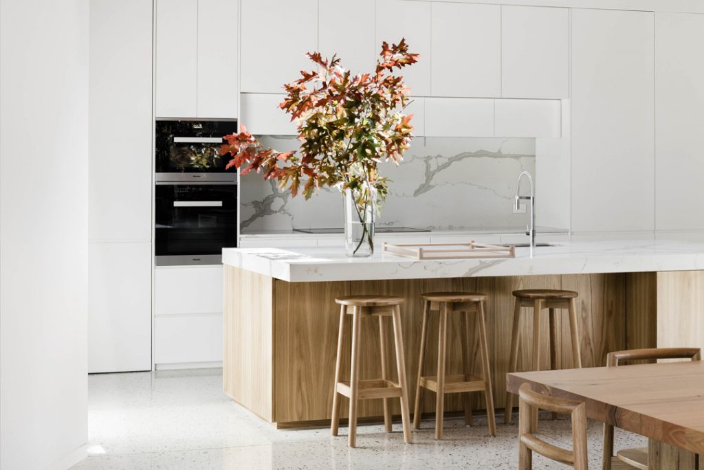
White interiors have been commonplace in homes for decades. The go-to hues when it’s too hard to find the right colour, white colour schemes are here to stay. But don’t underestimate a white interior done well. Neutral wall colours allow a room to breathe and furniture to be the standout pieces. Add bursts of colour for contrast or simply keep a softer palette for an uncluttered and soothing aesthetic. White works wonderfully in any space and can help make your home a haven.
Courtyard House by FIGR Interiors. Photography by Tom Blachford. Styling by Ruth Welsby.
Living Coral

Pantone’s colour of the year, Living Coral is a vivacious hue with golden undertones that energises and enlivens. As with all vivid hues, thoughtful planning is crucial when introducing it into a space. Small dashes of Living Coral in items such as linenware, lounge chairs or ceramics can be a good option to brighten a space without overwhelming it. A feature wall paired with neutral whites can also make a statement, particularly in a darker room, and can be the backdrop to a calmer yet playful palette.
Design by Note Design Studio. Photography by Kristoffer Fagerström of Note Design Studio.
Hero image: In Balance by Haymes — The Colour Forecast, Vol 12.
Originally published in Grand Designs Australia Vol. 8, No. 3