Inspired by a trip to Milan, Volume 9 of The Colour Library is set to change the way we incorporate colour into our homes
Though the term neutral is primarily synonymous with whites, greats and colourlessness, this need not always be so. During a recent trip to Milan, Wendy Rennie, Colour and Concept Manager at Haymes Paint, noticed colourful neutral palettes consisting of peachy, flesh-like tones and warm blues, which ultimately inspired Blended Neutrals – Volume 9 of The Colour Library.
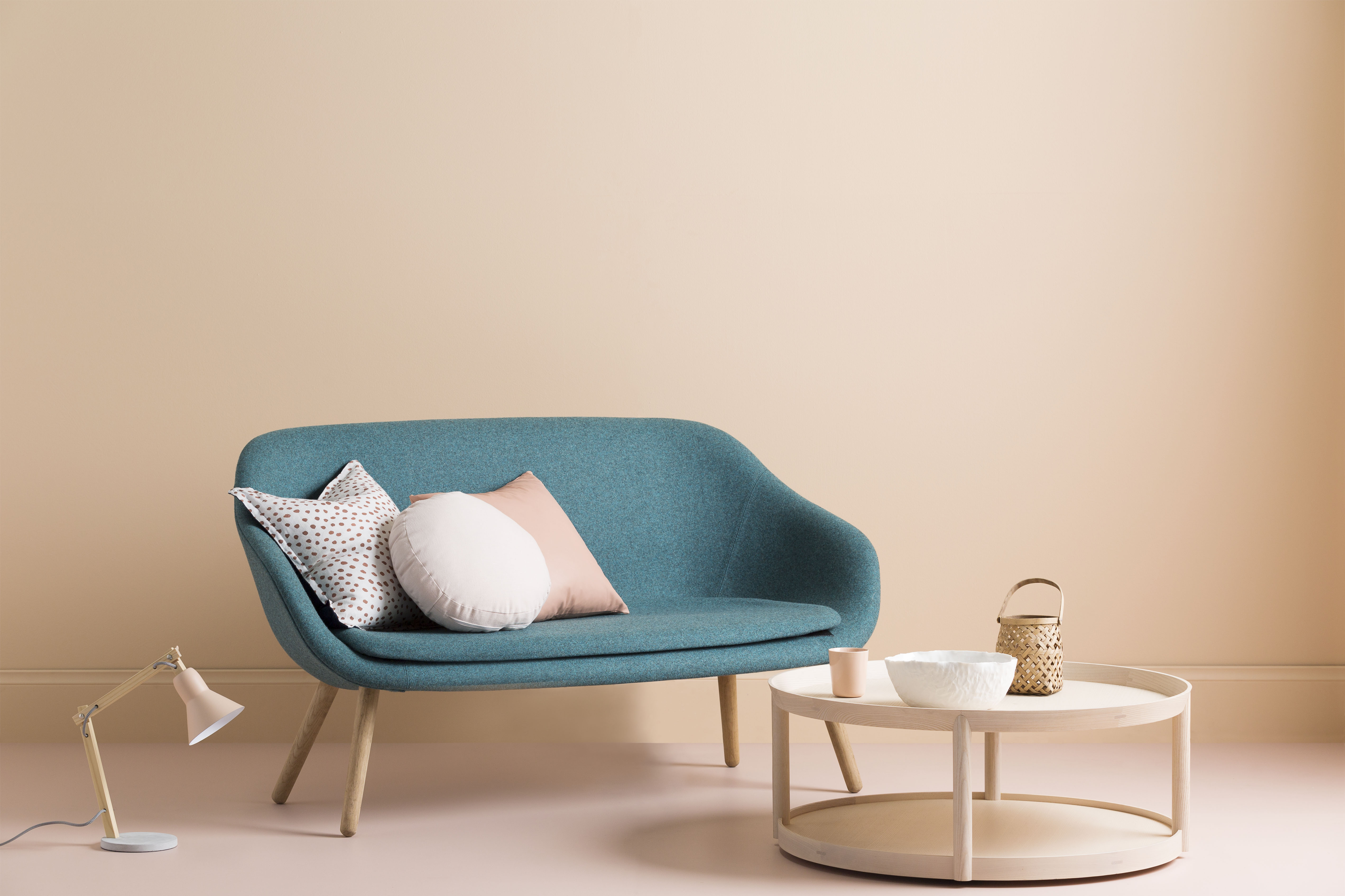
“I’ve developed this palette of nine neutrals to inspire, influence and engage consumers to use more colour in their homes. It’s a palette that contains hints of pink, peach and blue, which contrast well with the greys, injecting life and soul to interior spaces,” said Wendy.

“This more playful and relaxed approach to neutrals provides an opportunity for people to shift their approach from always using greys and whites to seeing how colour can be translated into making spaces warm, balanced and liveable.
“The hero colour of this palette, Siesta, a subtle peachy tone, can be used to create a relaxed and comfortable vibe in a bedroom, open plan living space or even a bathroom.”

“What I love about this palette is that it creates a wonderful conversation around the definition of neutrals and how we can use them in our homes to create playful, unique and relaxed spaces,” said Wendy.
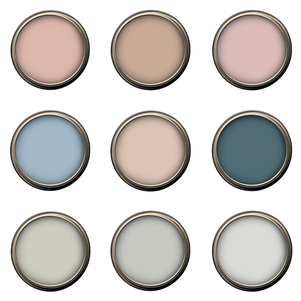
The Colour Library Vol 9: Blended Neutrals
Row 1, L- R: Rose Morn, Toadstool, Shell Pink
Row 2, L-R: Sun Dew, Siesta, Gem
Row 3, L-R: Feather Grey, Overcast, Grey Shadow
For more information: