Colour therapy is in the cards for 2017
We were fortunate enough to attend Sydney Design Festival’s Colours and Trends Forecast 2017 event recently, during which Dulux revealed their colour trends for the upcoming year.
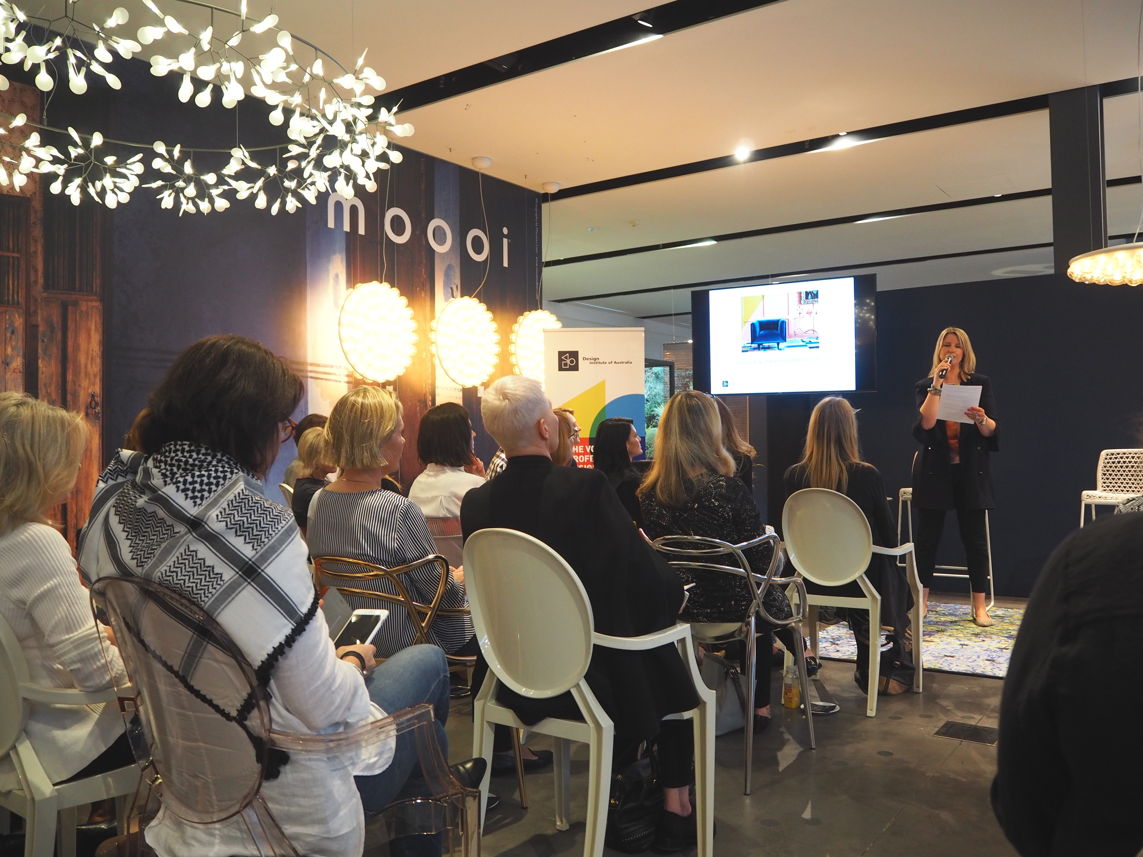
While Dulux colour palettes are always spectacular, these are particularly intriguing in that they are designed as an antidote to the pressures of modern life.
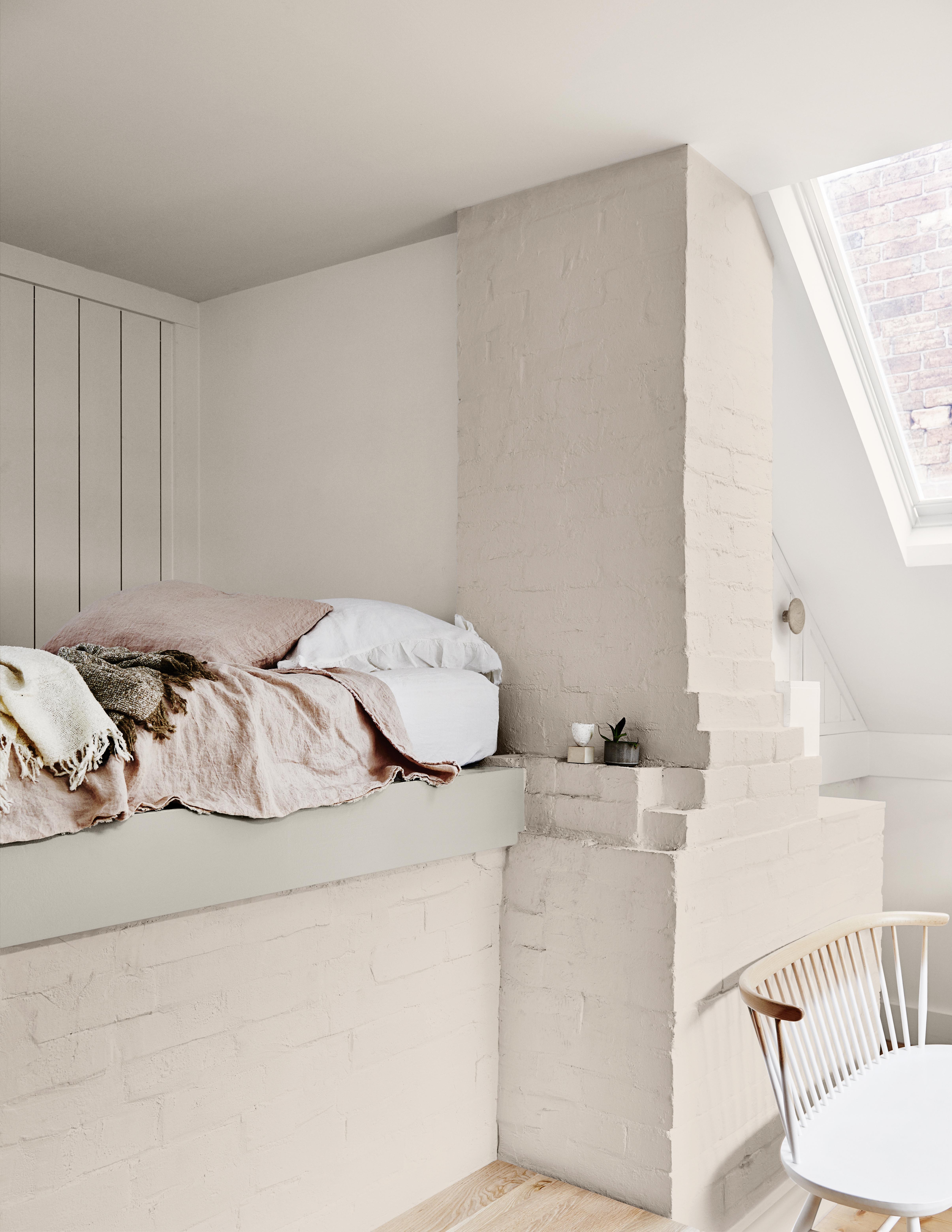
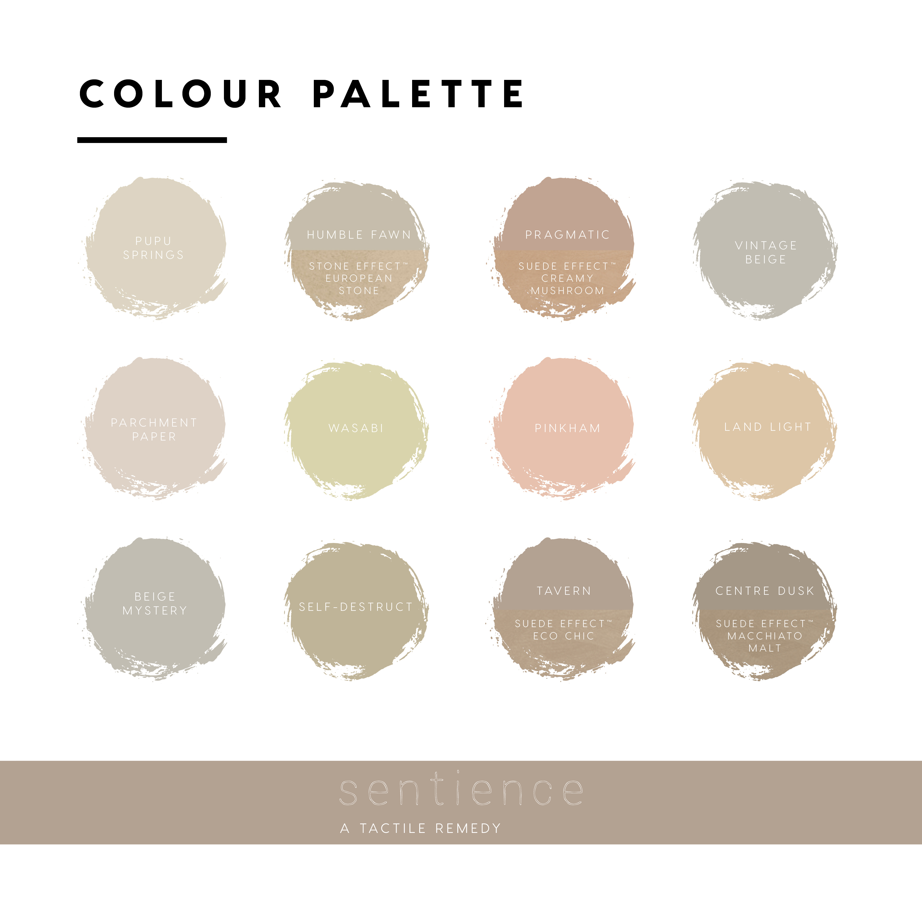
Sentience: a tactile remedy

Influences: textures and effects created by clay, minerals, stone and wood.

Chroma: a graphic view
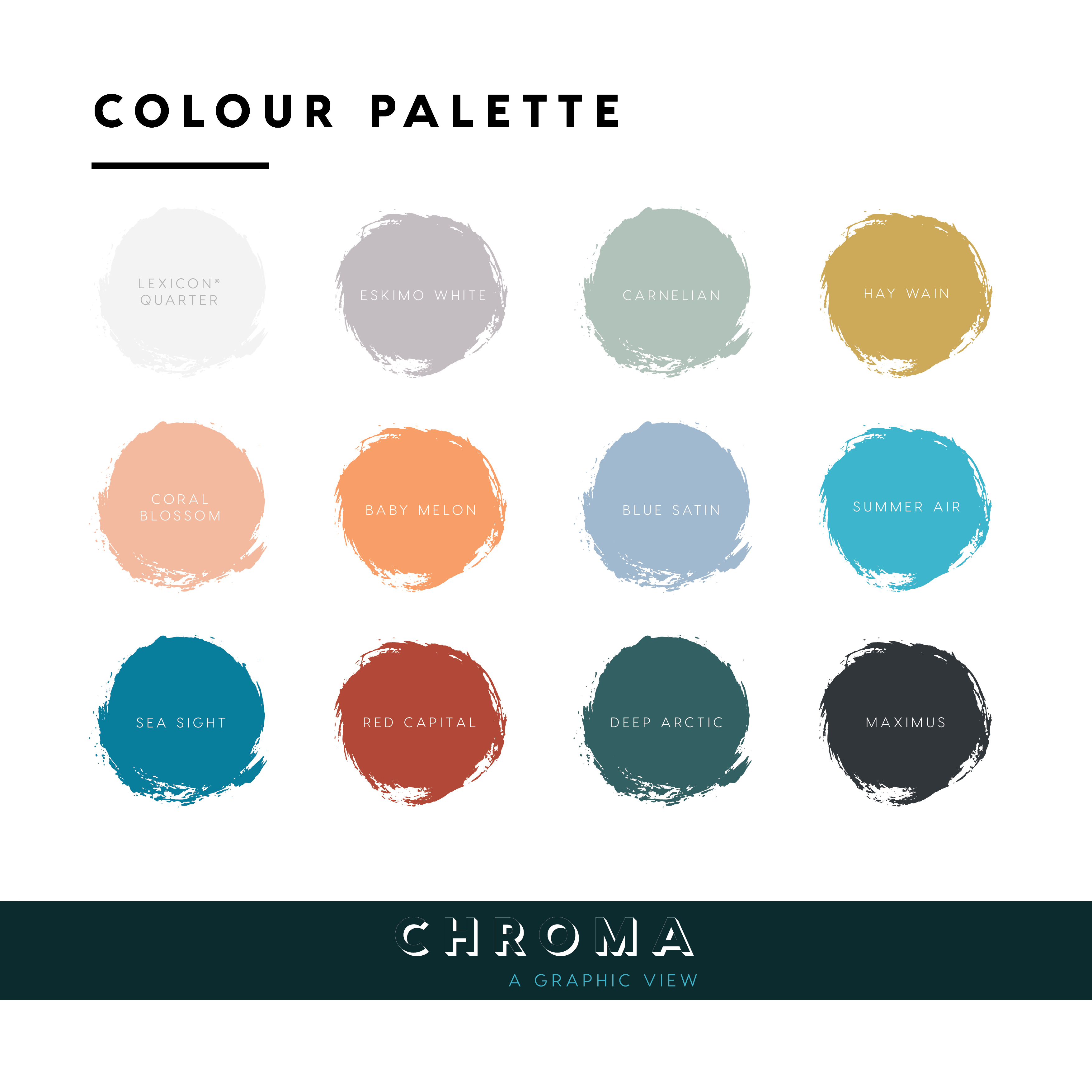
Influences: Memphis to Bauhaus movements, Salvador Dali’s work


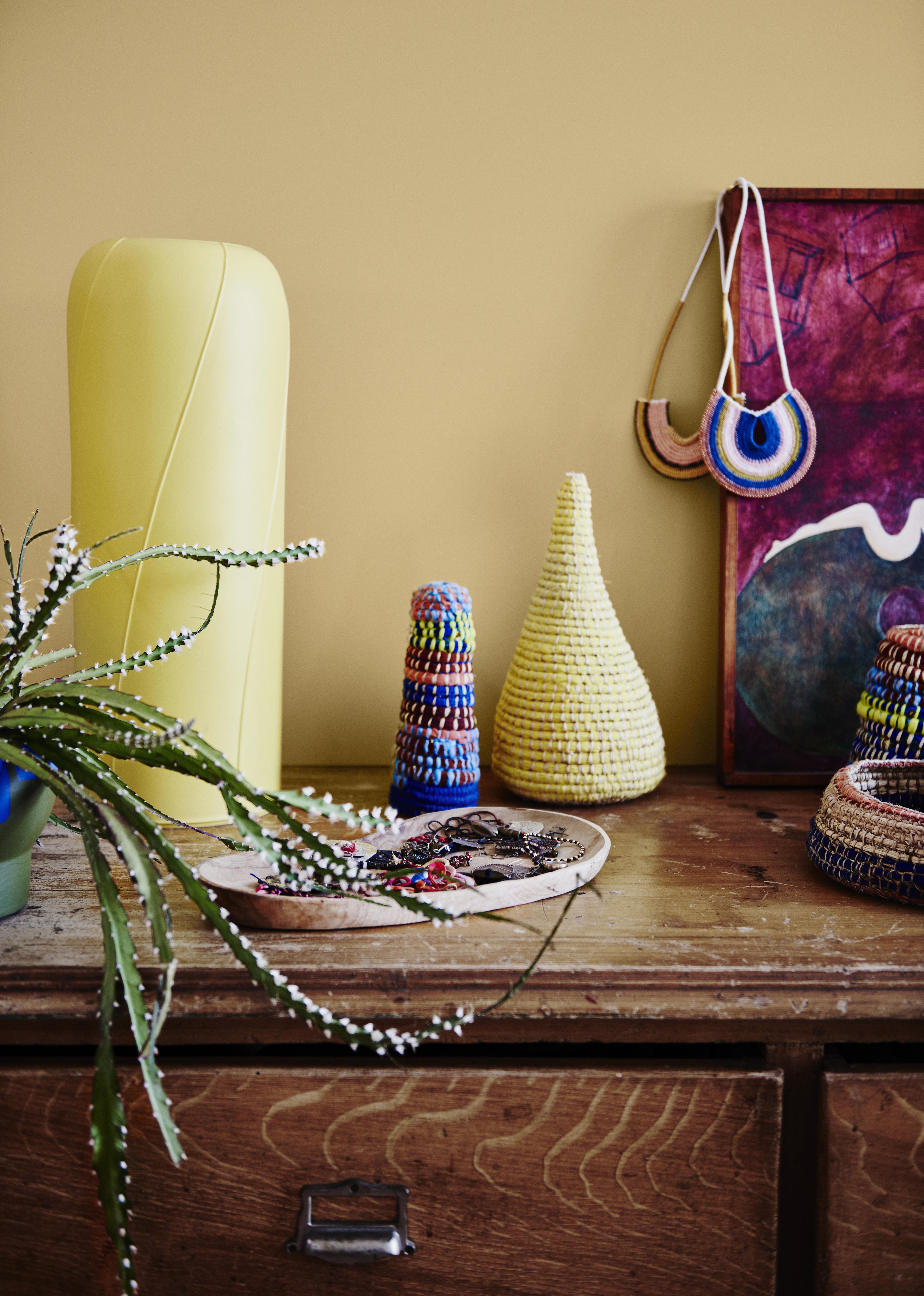
Entwine: a colourful weave
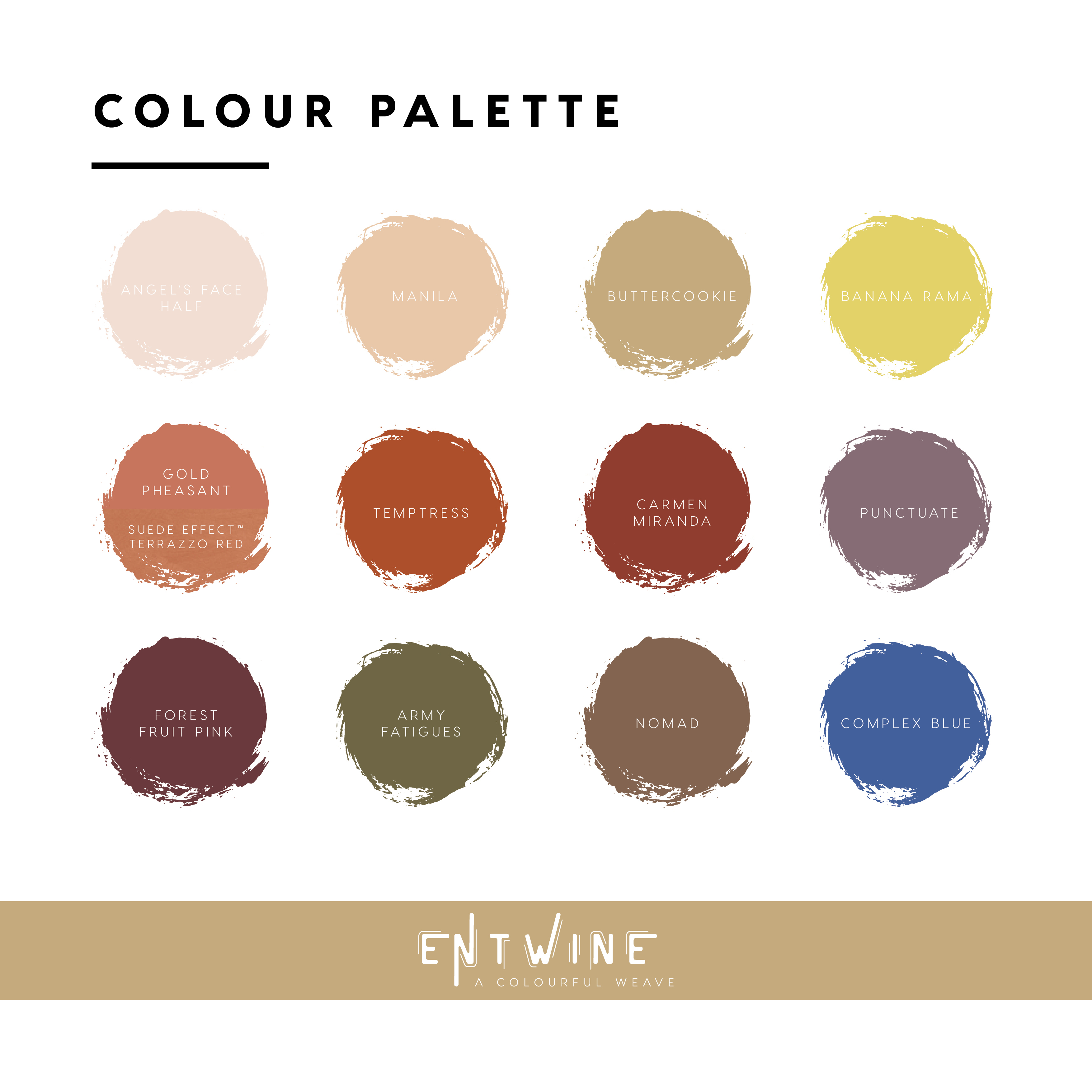
Entwine affirms the fact that we need to embrace a global view that extends beyond our backyard. The colours entwine modernity with tradition, and richness with warmth.
Influences: landscapes from South America to the Middle East

Construct: a luxe foundation
Influences: Brutalism, geometric shapes of the Bauhaus period, tarnished metals


For more information: dulux.com.au